
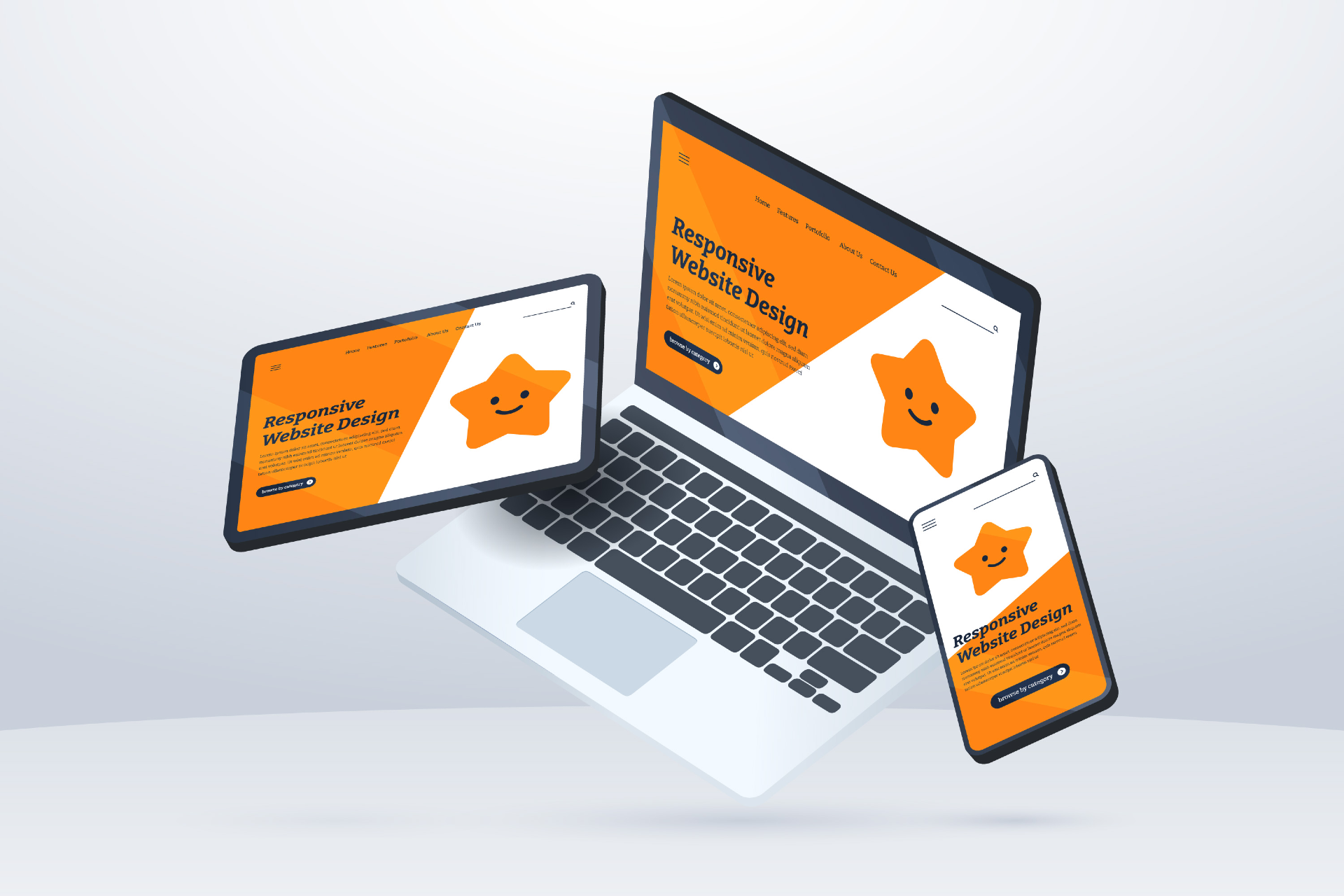
Importance Of Mobile Responsive Website
Having a mobile-responsive website is not just a trend but a necessity. A mobile-responsive website adapts its layout and design to suit various devices, providing an optimal viewing experience. Gone are the days when websites were designed exclusively for desktops. Today, users access websites from a myriad of devices, including smartphones and tablets. Most of the web designers ensure that your content looks impeccable regardless of the screen size.
Historical Evolution Of Mobile Friendly Website Design
The journey towards mobile responsiveness is intertwined with the evolution of the internet and the surge in mobile device usage. In the early days, websites were designed with fixed layouts, making them incompatible with the diverse screen sizes of emerging mobile devices. As smartphones gained popularity, the demand for websites that seamlessly adapt to different screens became apparent.
The historical evolution of mobile-responsive websites involves overcoming challenges and embracing innovative solutions. Milestones include the introduction of responsive design frameworks and the shift towards a mobile-first approach. As the Best Web Design company in Kerala Located, we know the landscape is vastly different, with websites prioritizing mobile responsiveness as a standard practice.
Key Components Mobile Responsive Website
Current Trends And Statistics
The prevalence of mobile devices in our daily lives is reflected in online traffic. Mobile responsiveness is not merely a recommendation; it significantly impacts user experience and search engine rankings. The statistics speak volumes, with a substantial percentage of internet users accessing websites through mobile devices. Websites that prioritize mobile responsiveness enjoy better engagement and higher conversion rates.
Benefits Of Mobile Responsiveness
The benefits of having a mobile-responsive website extend beyond accommodating different devices. Improved user experience is a key advantage. When visitors can effortlessly navigate and interact with your site on any device, it enhances satisfaction and encourages prolonged engagement. Moreover, search engines favor mobile-responsive websites, contributing to higher rankings and increased visibility.
Challenges And Solutions
While the importance of mobile responsiveness is undeniable, challenges may arise during implementation. Common issues include navigation difficulties, slow loading times, and design inconsistencies. Fortunately, solutions abound, ranging from adopting responsive design principles to utilizing tools that streamline the development process. Addressing these challenges head-on ensures a seamless transition to a mobile-responsive design.
Importance For Businesses
For businesses, the significance of mobile responsiveness cannot be overstated. With a growing number of consumers using mobile devices for online activities, having a website that caters to this audience is essential. A mobile-responsive site enhances online visibility, contributing to a positive brand image. Furthermore, it fosters customer satisfaction and loyalty, as users appreciate the convenience of accessing content on the go.
How To Make Your Website Mobile Responsive
Creating a mobile-responsive website involves adhering to responsive design principles. This includes using flexible grids and layouts, employing media queries, and optimizing images for different screen sizes. Various tools and resources, such as responsive design frameworks and testing platforms, simplify the process. By incorporating these techniques, most of the web design companies in Kerala ensure that your website delivers a consistent and appealing experience across devices.
• Testing and Optimization
The journey to mobile responsiveness doesn’t end with the initial design. Regular testing is crucial to identify and rectify any issues that may arise. This involves checking the site’s performance on various devices and browsers. Ongoing optimization is equally important, as technology and user preferences evolve. By staying proactive in testing and optimizing, you guarantee a continuously responsive and user-friendly website.
• Future of Mobile Responsiveness
As technology advances, so does the landscape of mobile responsiveness. Emerging trends include the integration of AI in responsive design, creating even more personalized and intuitive user experiences. The rise of wearable devices adds another layer of complexity, demanding innovative solutions for seamless integration. Keeping an eye on these future developments ensures that your website remains at the forefront of mobile responsiveness.
• Case Studies
Examining successful examples of mobile-responsive websites provides valuable insights. Case studies showcase the positive impact of prioritizing mobile responsiveness, from increased user engagement to higher conversion rates. Learning from these examples and understanding the strategies implemented can guide website owners in optimizing their own sites for diverse devices.
• User Experience and Mobile Responsiveness
The relationship between user experience (UX) and mobile responsiveness is symbiotic. A website that prioritizes mobile responsiveness contributes to a positive UX, fostering satisfaction and loyalty. Tips for optimizing UX on mobile devices include intuitive navigation, fast loading times, and mobile-friendly content formatting. By focusing on the intersection of UX and mobile responsiveness, you create a website that resonates with your audience.
• Common Misconceptions
Misconceptions about mobile responsiveness may hinder some website owners from embracing this essential practice. Debunking myths, such as the belief that responsive design is complex or costly, clarifies the benefits and dispels unwarranted concerns. Educating website owners about the realities of mobile responsiveness encourages wider adoption and ensures that more online platforms prioritize user experience.
• Importance of Regular Updates
In the fast-paced world of technology, regular updates are crucial for maintaining mobile responsiveness. Changes in devices, browsers, and user behavior necessitate ongoing adjustments to ensure optimal performance. Regular updates not only address potential issues but also position your website to embrace emerging trends, keeping it competitive and resilient in the ever-evolving digital landscape.
Unveiling The SEO Benefits Of Mobile-Responsive Websites
In the dynamic realm of online presence, the synergy between mobile responsiveness and Search Engine Optimization (SEO) plays a pivotal role. As search engines continually refine their algorithms to prioritize user experience, having a mobile-responsive website is no longer just a choice but a strategic necessity for enhancing search rankings and visibility.
1. SEO Benefits
The intertwining of mobile responsiveness and SEO brings forth a myriad of benefits. Search engines, particularly Google, favor websites that are mobile-friendly when determining search rankings. This preference stems from the acknowledgment that a significant portion of users accesses the internet through mobile devices. As a result, mobile-responsive websites often enjoy higher search rankings, leading to increased organic traffic.
2. Google’s Mobile-Friendly Algorithm
Google, being the dominant player in the search engine arena, introduced the Mobile-Friendly Algorithm to prioritize mobile-responsive websites in search results. This algorithm assesses the mobile compatibility of websites, considering factors such as responsive design, optimized images, and mobile-friendly navigation. Websites that pass these criteria receive a boost in rankings, while those lacking mobile responsiveness may see a decline in visibility.
3. Search Rankings and Visibility
Search rankings and visibility are inextricably linked to the mobile responsiveness of a website. When users perform searches on mobile devices, Google aims to deliver results that provide the best user experience. Mobile-responsive websites are more likely to appear prominently in search results, capturing the attention of users and driving organic traffic. Conversely, websites that are not optimized for mobile may find themselves relegated to lower search positions, limiting their visibility to potential visitors.
4. Importance of SEO
Beyond meeting the criteria set by search engine algorithms, a mobile-responsive website aligns with the broader goals of SEO – delivering a positive user experience. Websites that load quickly, display properly on various screen sizes, and offer intuitive navigation contribute to user satisfaction. This positive experience translates into longer dwell times, lower bounce rates, and increased engagement – factors that Google considers when determining the relevance and authority of a website.
In essence, the symbiotic relationship between mobile responsiveness and SEO is a strategic imperative for website owners. By embracing mobile-friendly design principles, optimizing for Google’s Mobile-Friendly Algorithm, and prioritizing user experience, websites can not only secure higher search rankings but also create a digital presence that resonates with their audience.
Advantages Of Mobile-Responsive Websites
1. Increased Mobile Traffic
As mobile devices become ubiquitous in our daily lives, users are increasingly relying on smartphones and tablets to access online content. A mobile-responsive website taps into this trend, ensuring that your business remains accessible to a vast audience. The result? Increased mobile traffic. By providing an optimal user experience on mobile devices, you create a pathway for users to discover and engage with your business, driving a steady flow of traffic.
2. Higher Conversion Rates
Mobile responsiveness is not just about attracting visitors; it’s about converting them into customers. A website that seamlessly adapts to different screen sizes and devices enhances user experience, instilling confidence in potential customers. The convenience of navigating through products or services on a mobile-responsive site contributes to higher conversion rates. Users are more likely to complete transactions when the process is smooth and user-friendly, translating into tangible business growth.
3. Reach to Diverse Demographics
The diversity of user demographics cannot be understated, and their preferences for accessing the internet vary. A mobile-responsive website ensures that your business reaches a diverse audience, irrespective of the device they use. Whether it’s a young professional on a smartphone or an older individual on a tablet, a responsive design accommodates different demographics. This inclusivity expands your business’s reach, opening avenues for connecting with a broader and more varied customer base.
4. Competitive Advantage
A mobile-responsive website provides a competitive edge by meeting the expectations of modern consumers. Search engines, like Google, prioritize mobile-friendly sites in their rankings, giving responsive websites a visibility advantage. Moreover, users are more likely to choose a business with a mobile-responsive site over one with a non-responsive counterpart, reinforcing the importance of staying ahead in the digital race.
5. Business Advantages
At its core, the advantages for businesses in embracing mobile responsiveness are multifaceted. Beyond the technical intricacies, a responsive website contributes to brand credibility, customer trust, and long-term success. It reflects a commitment to providing an optimal experience for users, fostering a positive perception of your brand. This positive association can result in repeat business, word-of-mouth referrals, and a resilient position in the competitive market.
Conclusion
To sum up, the transformation of websites towards mobile responsiveness reflects the ever-changing nature of the digital world. Starting from the rigid layouts of the past to today’s seamless adaptability, this journey has been characterized by innovation and a dedication to user-friendly design. Mobile responsiveness isn’t just a passing trend; it’s a strategic choice that enhances user experience, boosts SEO, and contributes to overall business success.
Achieving mastery in responsive web design requires a blend of current best practices, a considerate approach to images and media, attention to typography, and an anticipation of upcoming trends. Embracing these principles ensures that your website not only meets the demands of today’s diverse digital landscape but also stays adaptable and innovative in the years ahead.